Case Study
Will + Blu Interiors
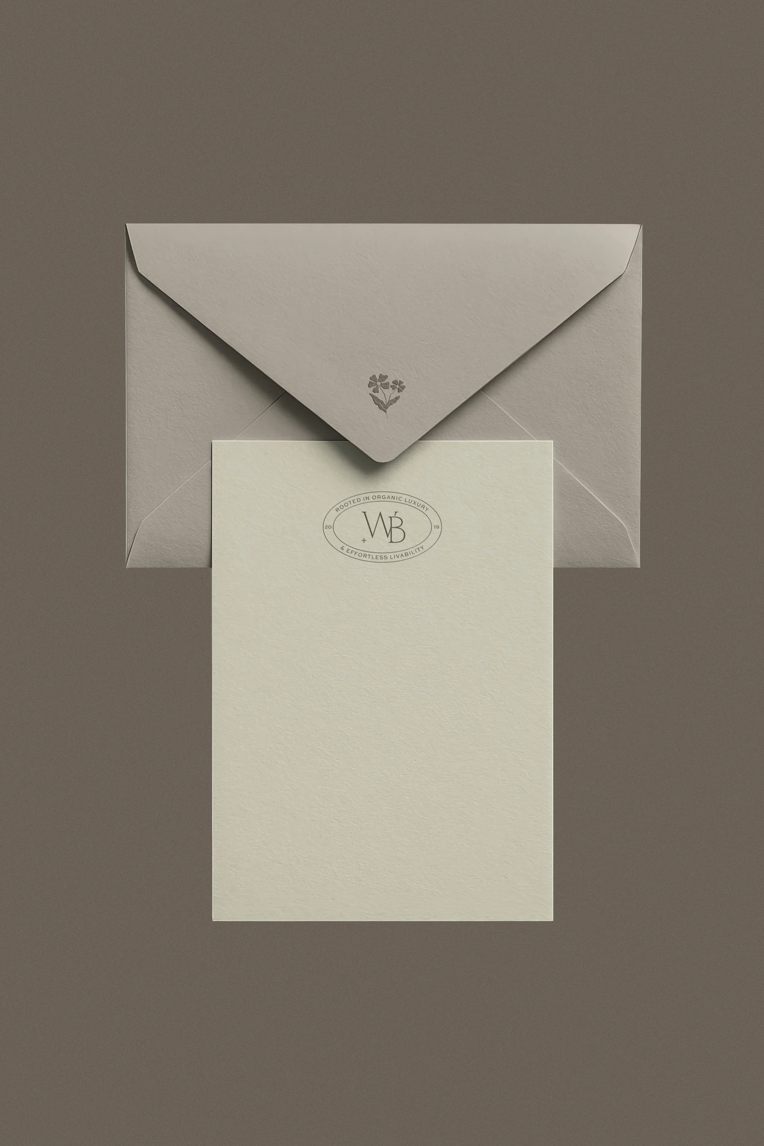
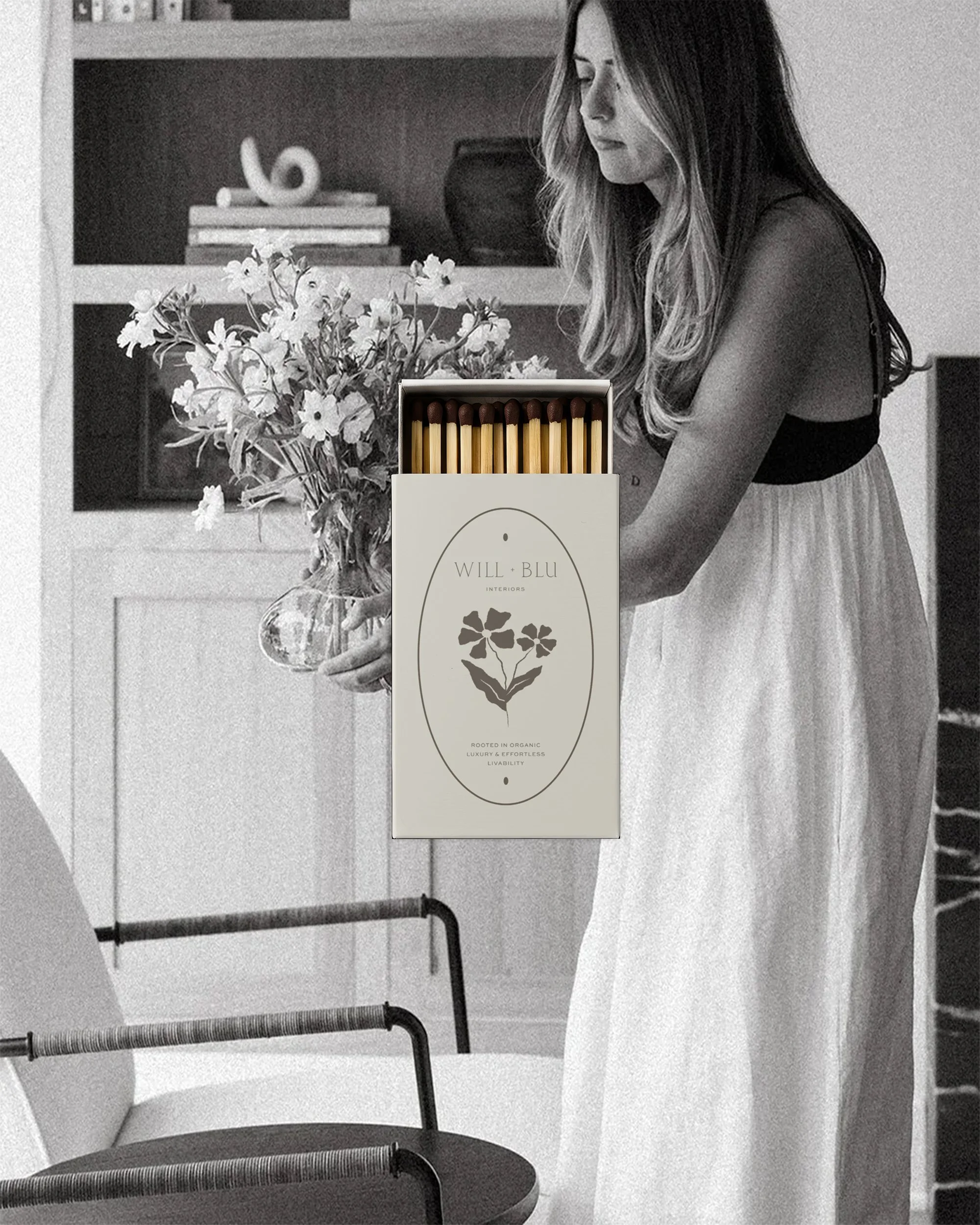
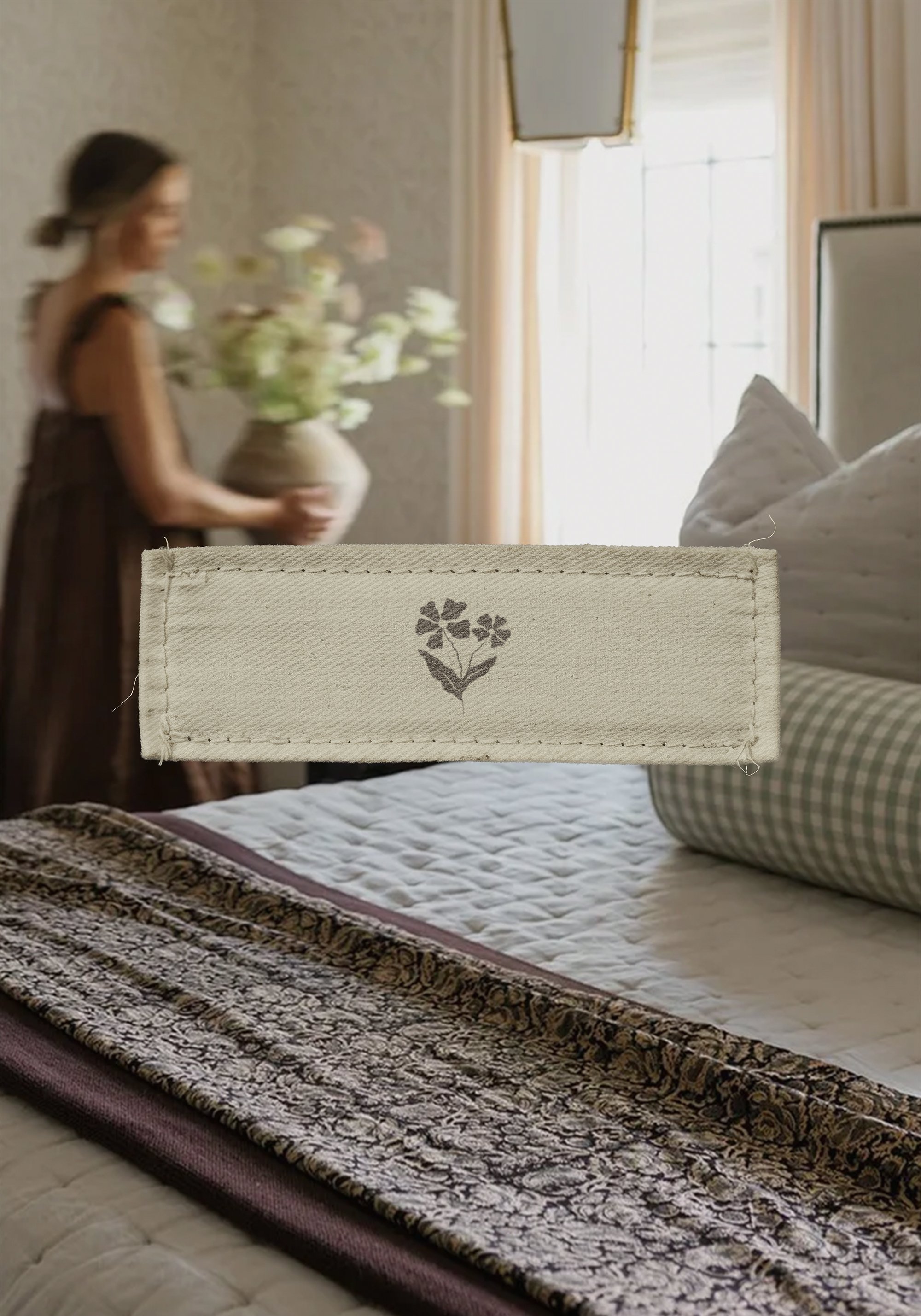
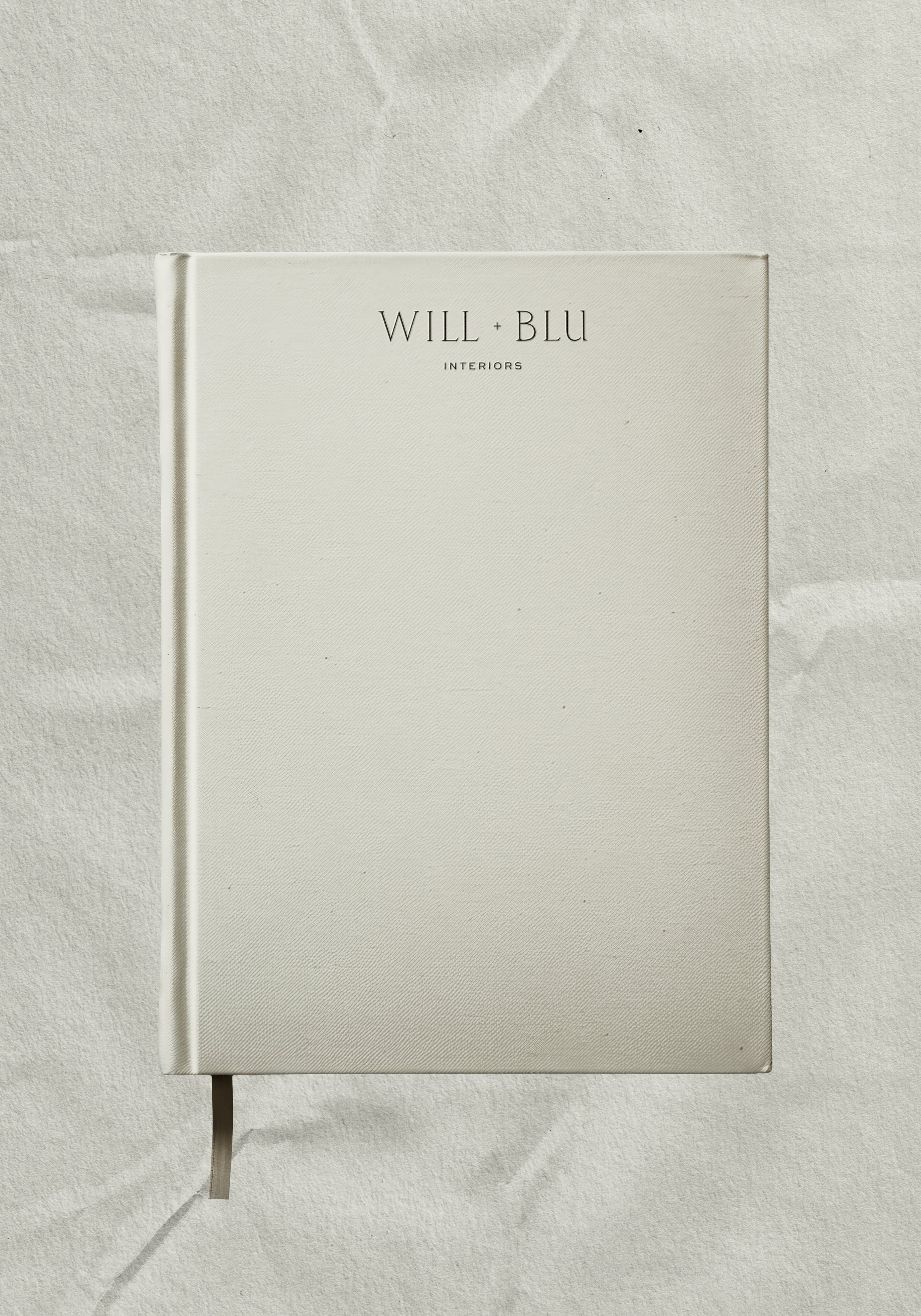
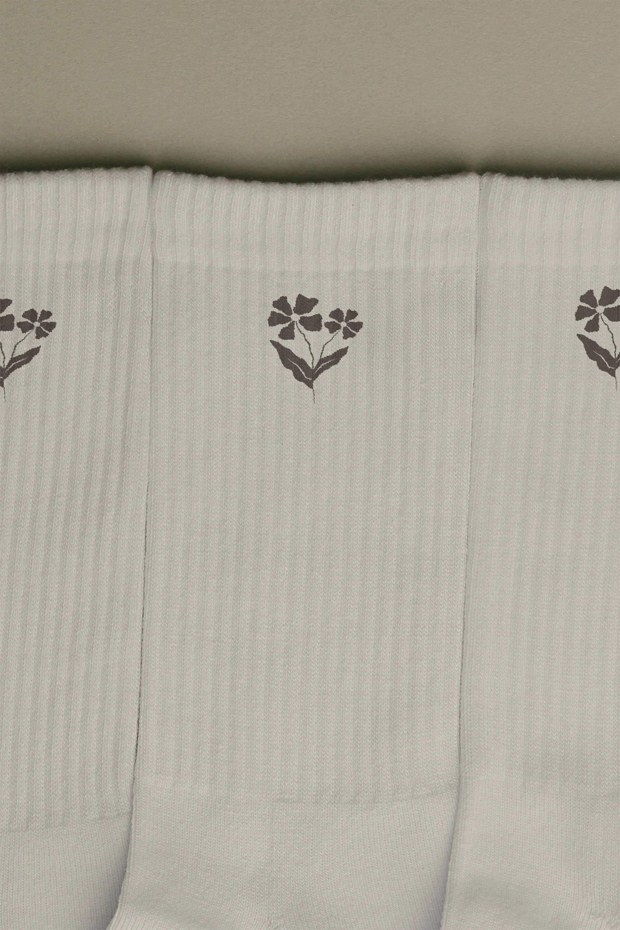
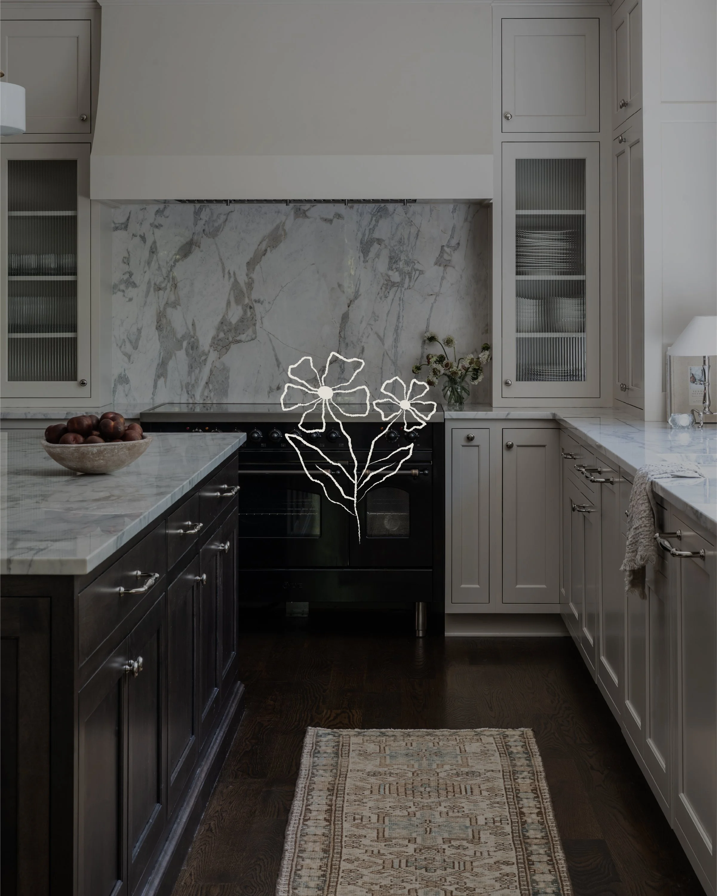
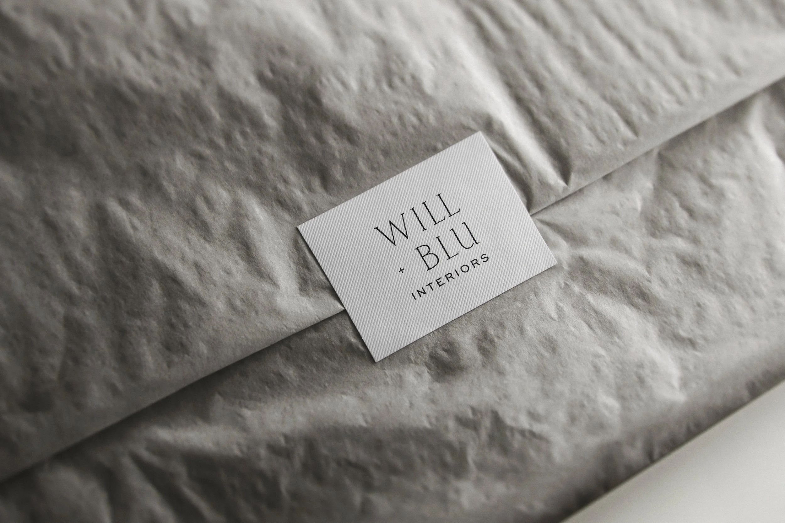
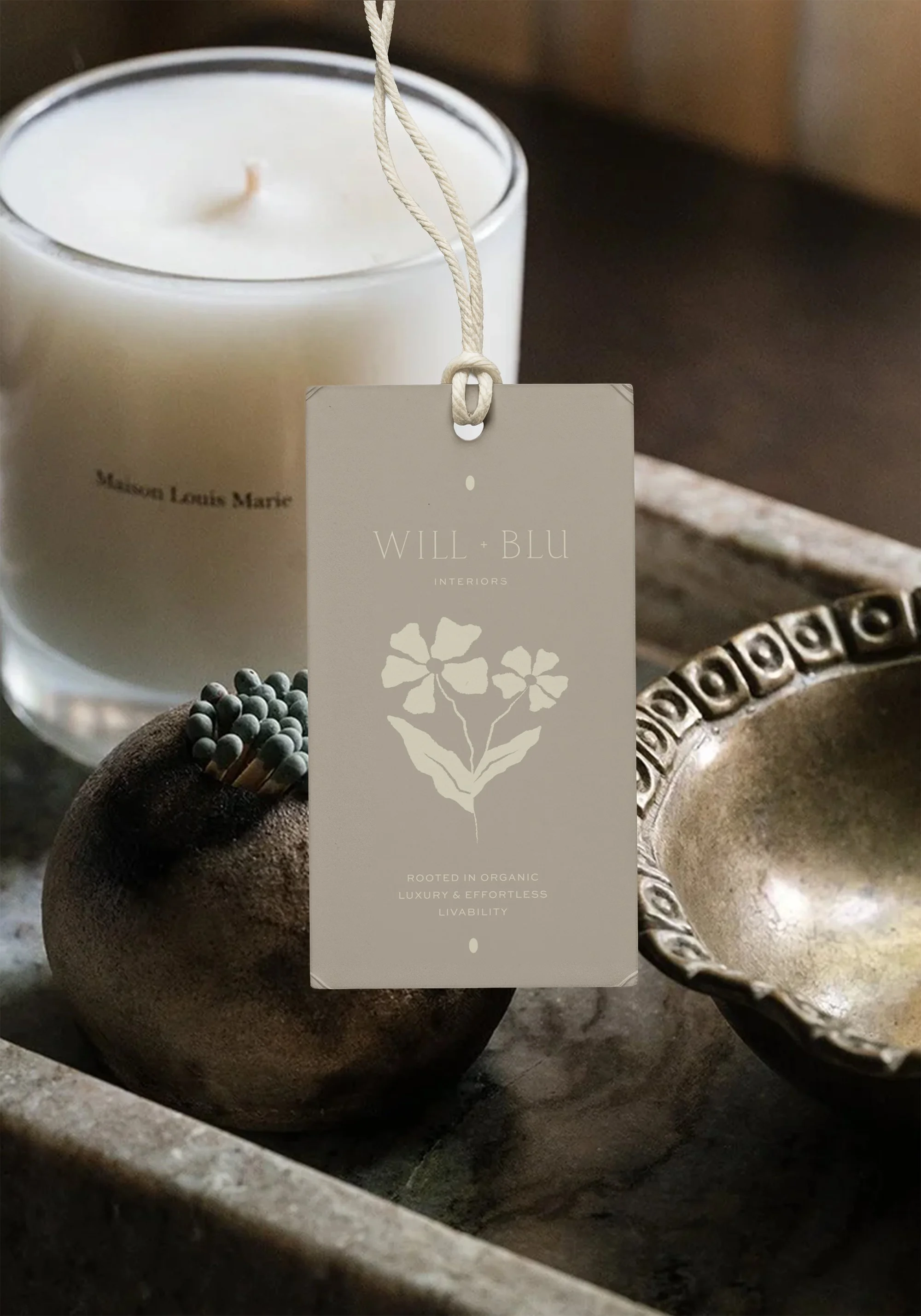
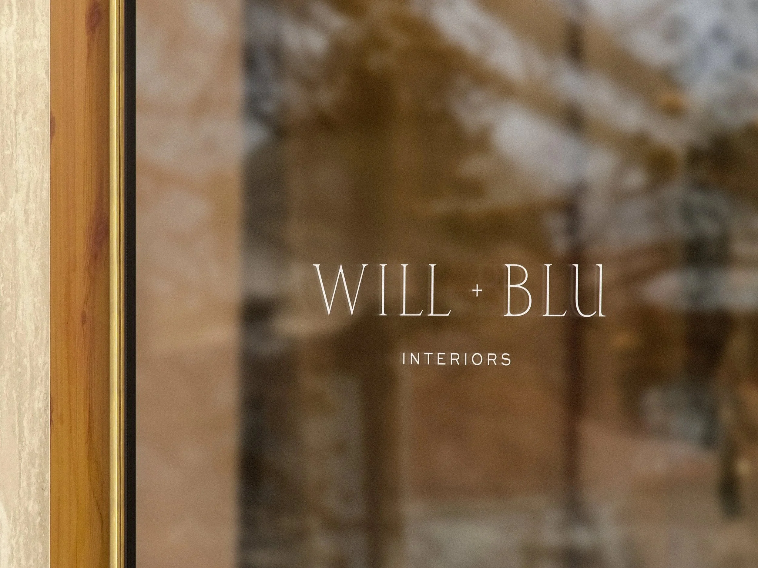
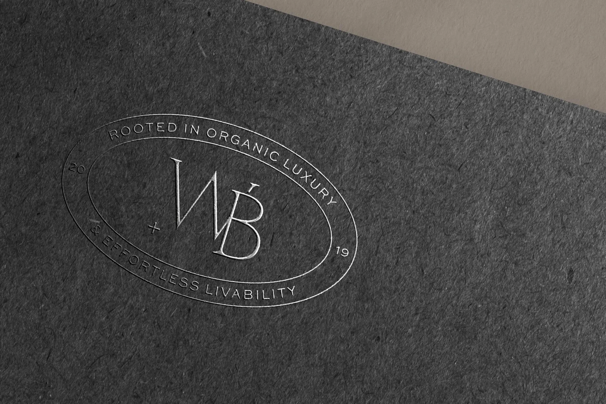
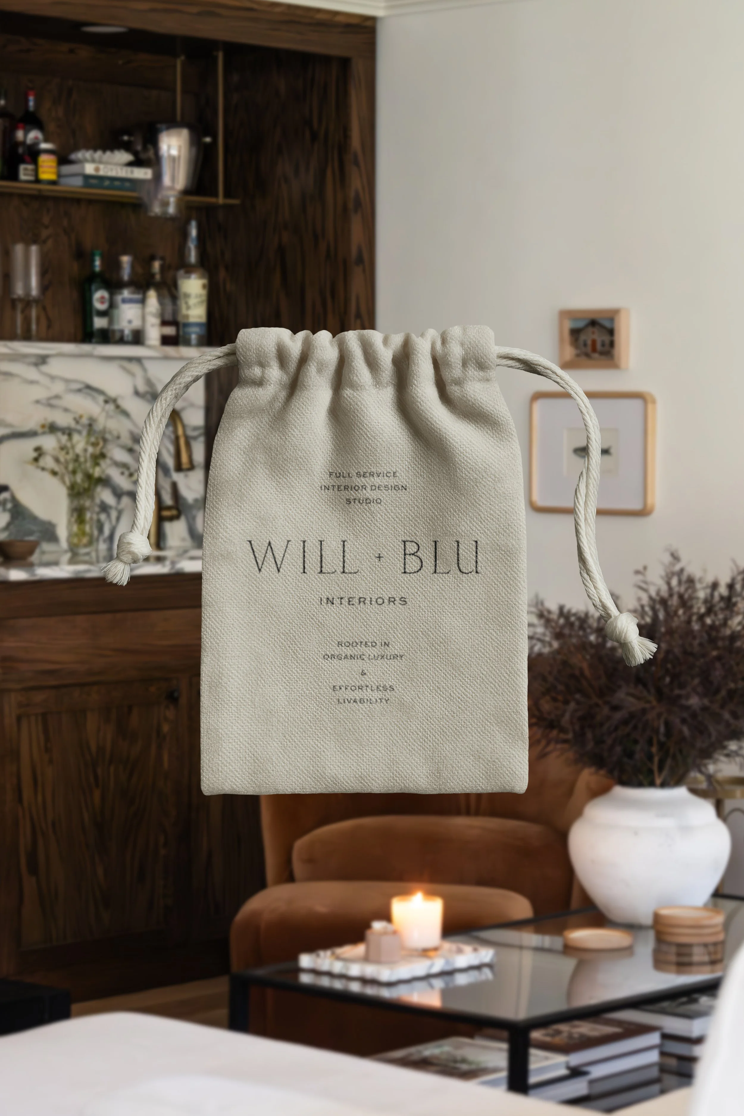
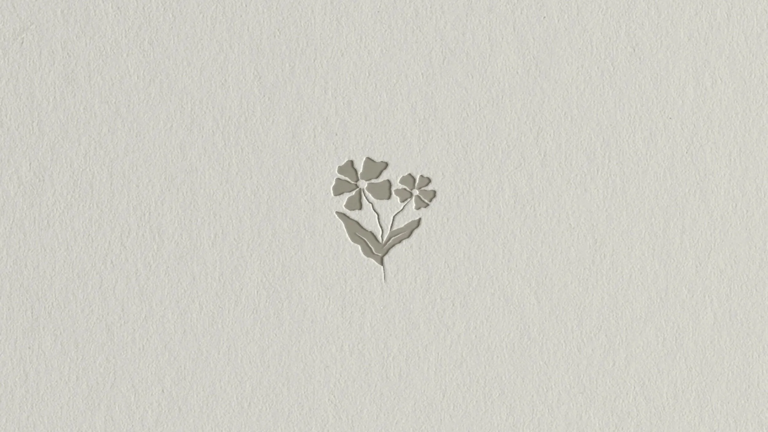
Will + Blu Interiors came to me with a need for a full brand refresh and website overhaul, but in a simplified + refined kind of way. Owner and Principal Designer, Brittany Poll, had a clear vision — clean typography, earthy neutrals, and a brand mark that felt unique to them. Countless florals were drawn to achieve this custom branded flower — a symbol that defines the luxurious yet natural element included in all their interiors projects. We perfected every letterform in the logotype — tweaking serif sizes, lengths, and proportions.
The website remains intentionally minimalist, featuring some really incredible photography from their latest work. My favorite part? The embossed brand flower in the footer. Swoon.
Please explore, and get lost in the world of Will + Blu.
Case study includes —
brand identity: primary logo, stacked logo, brand mark, supporting marks, typography, color palette
website design
client gifting packages
Testimonial
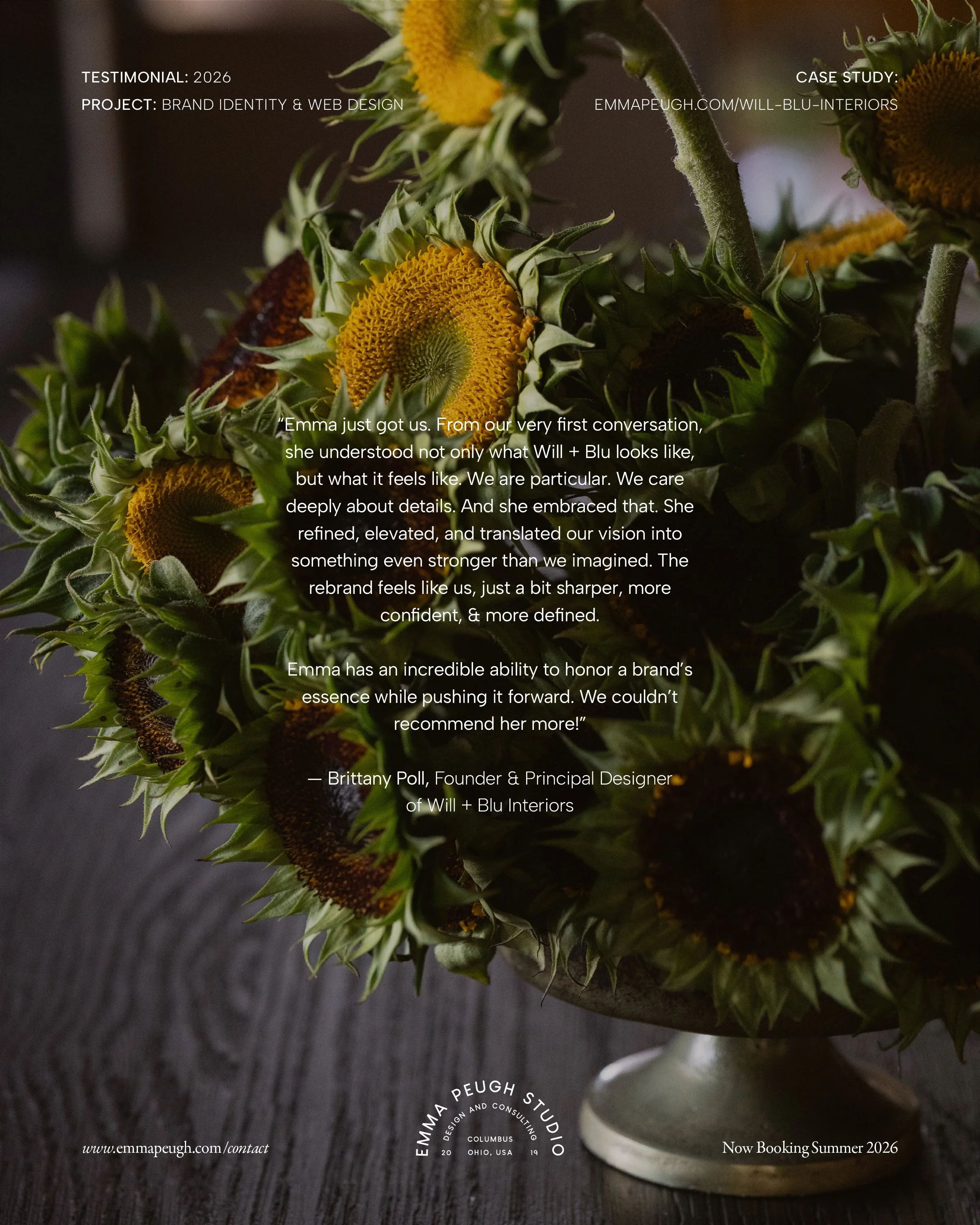
“Emma just got us. From our very first conversation, she understood not only what Will + Blu looks like, but what it feels like. We are particular. We care deeply about details. And she embraced that. She refined, elevated, and translated our vision into something even stronger than we imagined. The rebrand feels like us, just a bit sharper, more confident, & more defined. Emma has an incredible ability to honor a brand’s essence while pushing it forward. We couldn’t recommend her more!”
— Brittany Poll, Founder & Principal Designer