CASE STUDY
TRANSITIONS
Brand identity, website and marketing booklet created for new business focusing on luxury estate buying, Transitions. The goal was to evoke thoughtfulness, as anyone utilizing this service is going through a difficult time with a loss. The branding was to be colorful and cheery, yet empathetic and powerful.
Case study includes —
primary logo & secondary marks
color palette & typographic system
marketing booklet
Squarespace website design & development
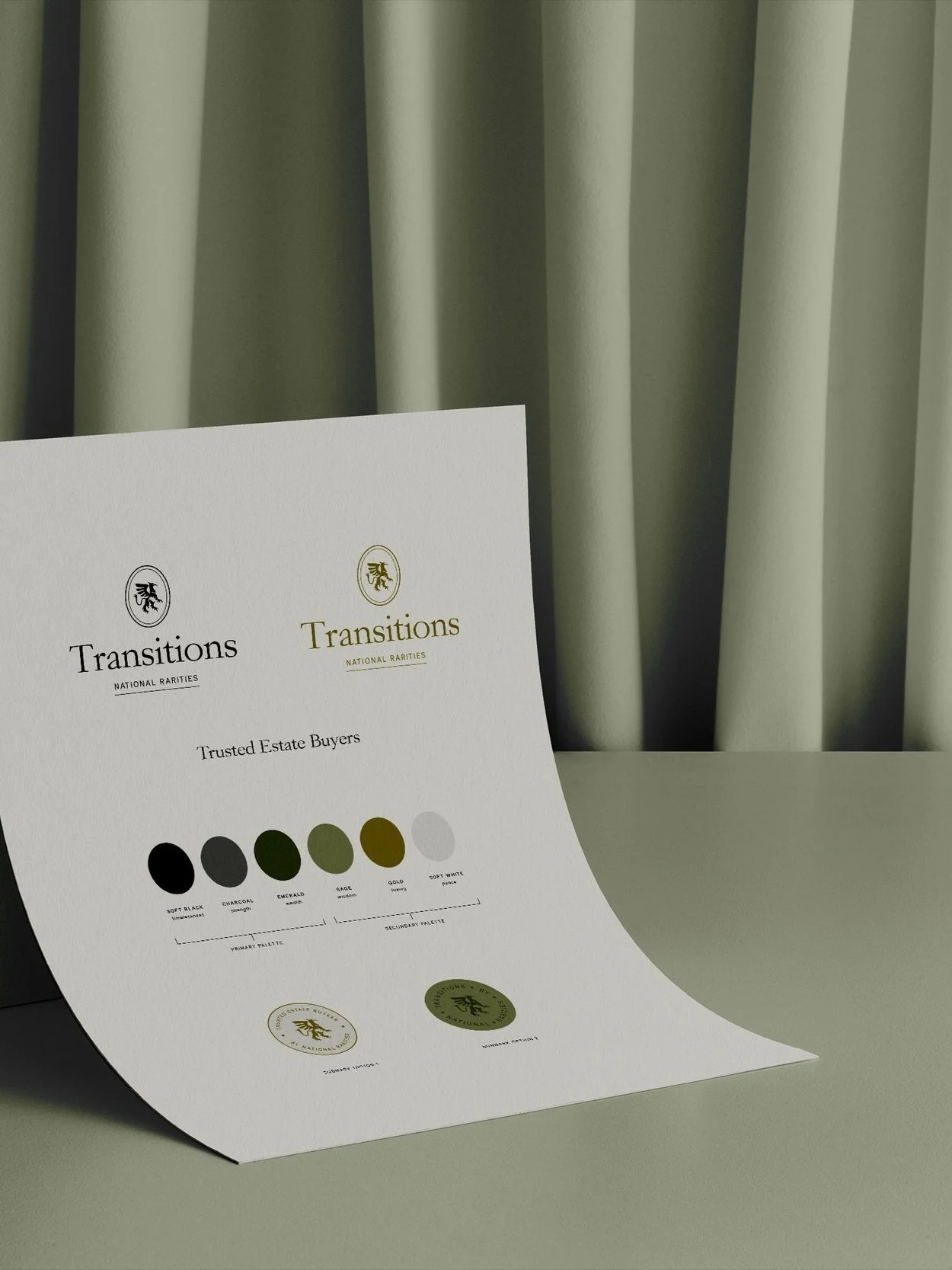
BRAND GUIDELINES
A culmination of brand elements showcased in one space.
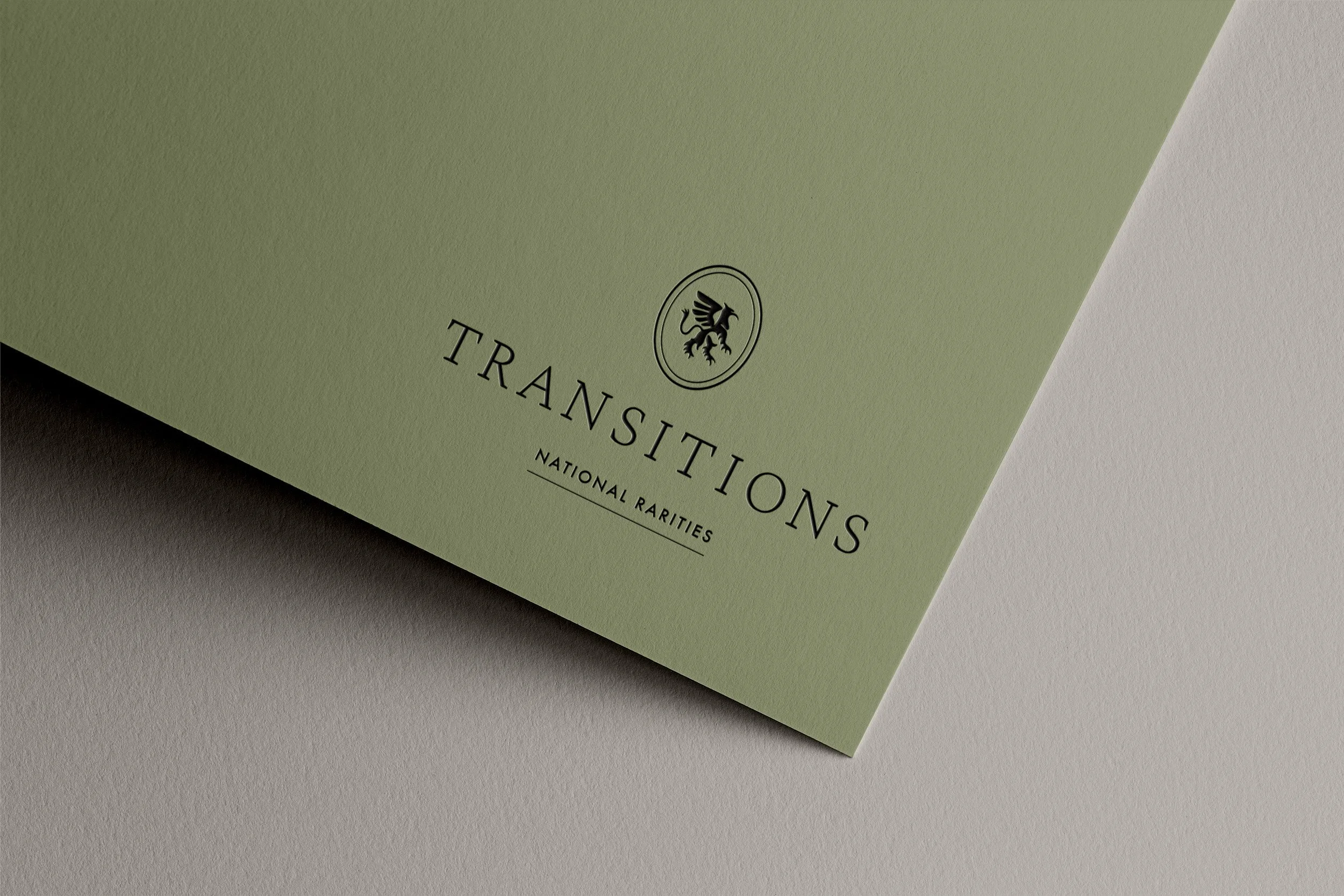
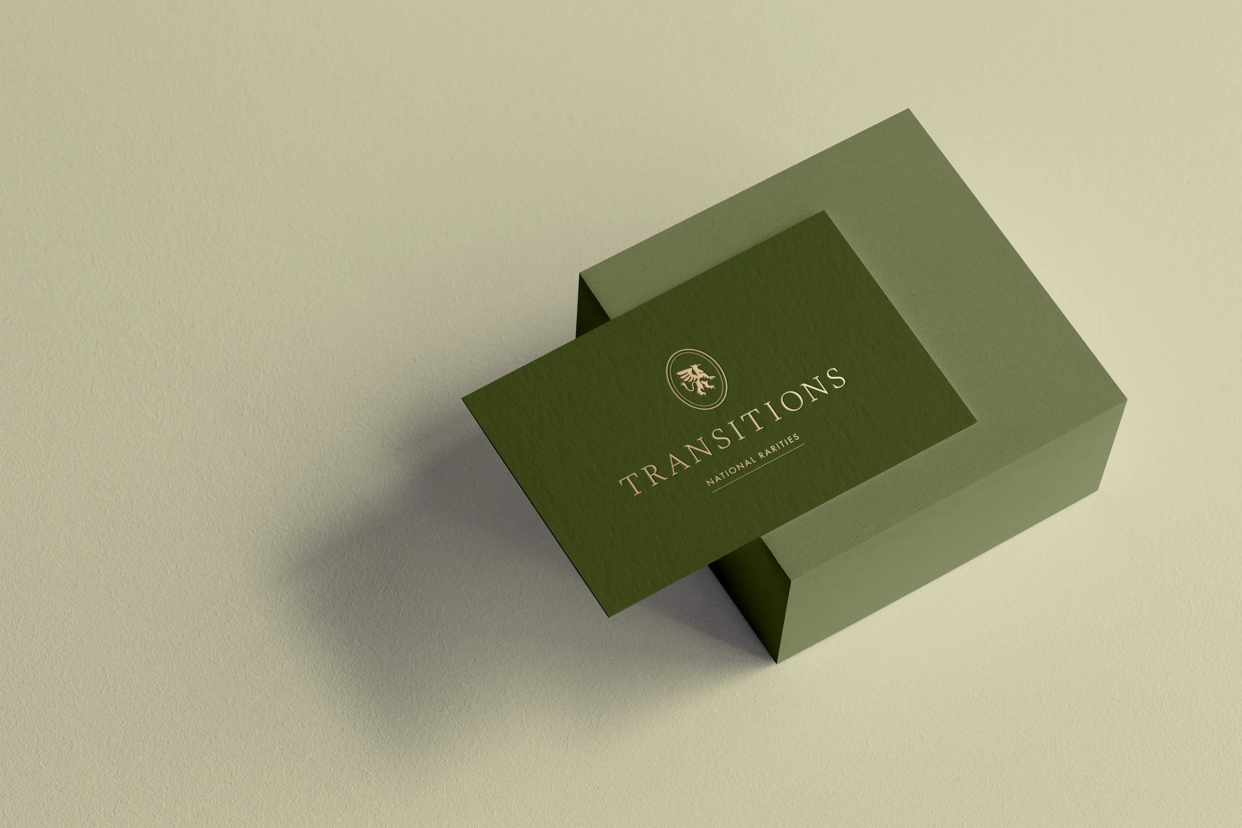
BEHIND THE LOGO
The primary logo, above, exudes a sophistication because of the serif typeface and classic type treatment. The submarks and icons below showcase a griffin enclosed in a circular shape, meaning protection and trust.
SUBMARK


ICON


MARKETING BOOKLET
Strong photography, simplistic layouts and the brand’s type hierarchy utilized in a printed marketing booklet for outreach and partnerships.


WEBSITE: SQUARESPACE DESIGN & DEVELOPMENT

The Transitions website follows an organized grid layout for people of all ages to easily navigate. A mixture of black & white and color photography is used to add a layer of interest, while remaining timeless in aesthetic. A strong type hierarchy is used to create an eye-catching structure that flows seamlessly.