CASE STUDY

FOLCHI CREATIVE

Visit folchicreative.com

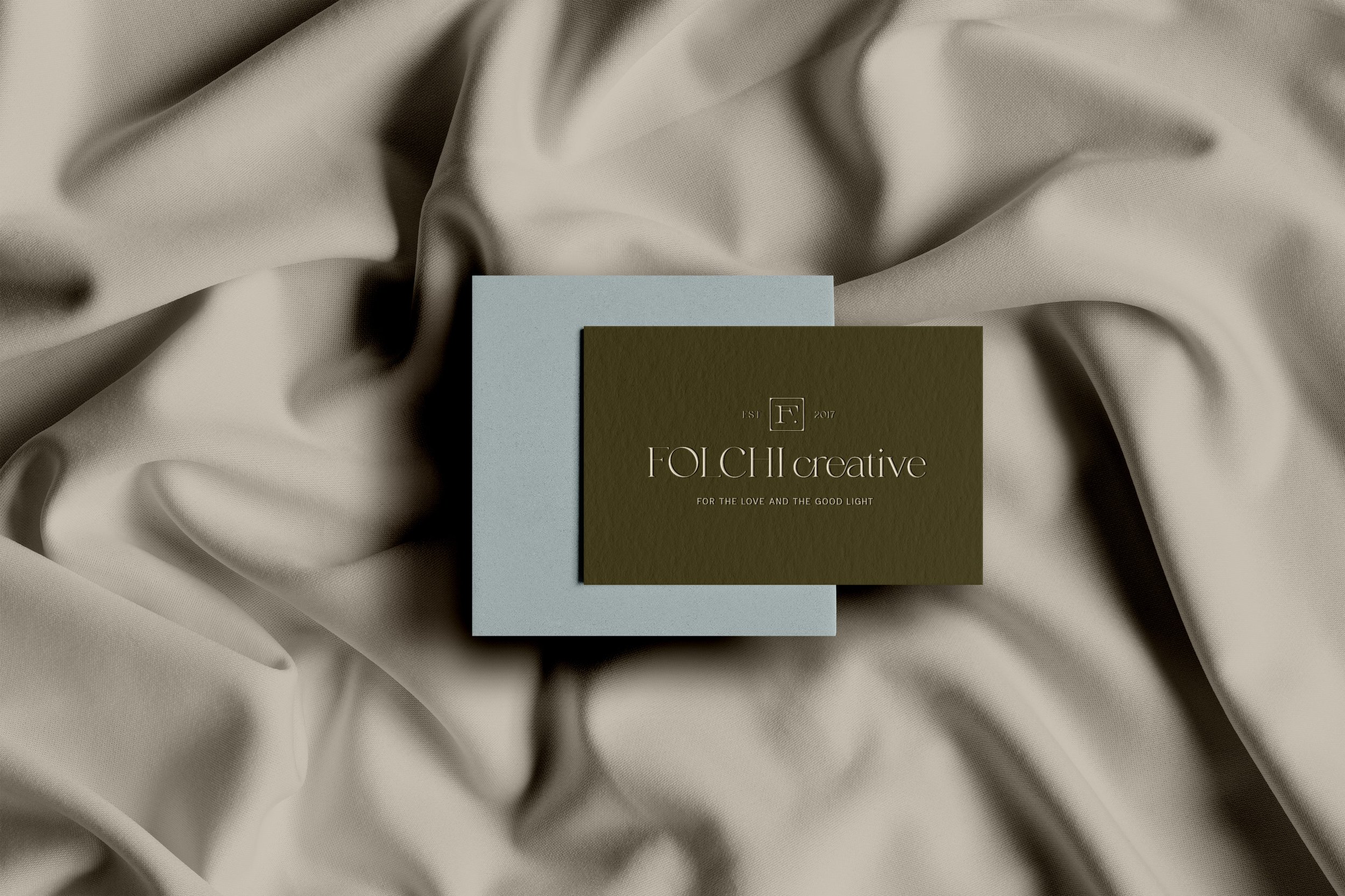
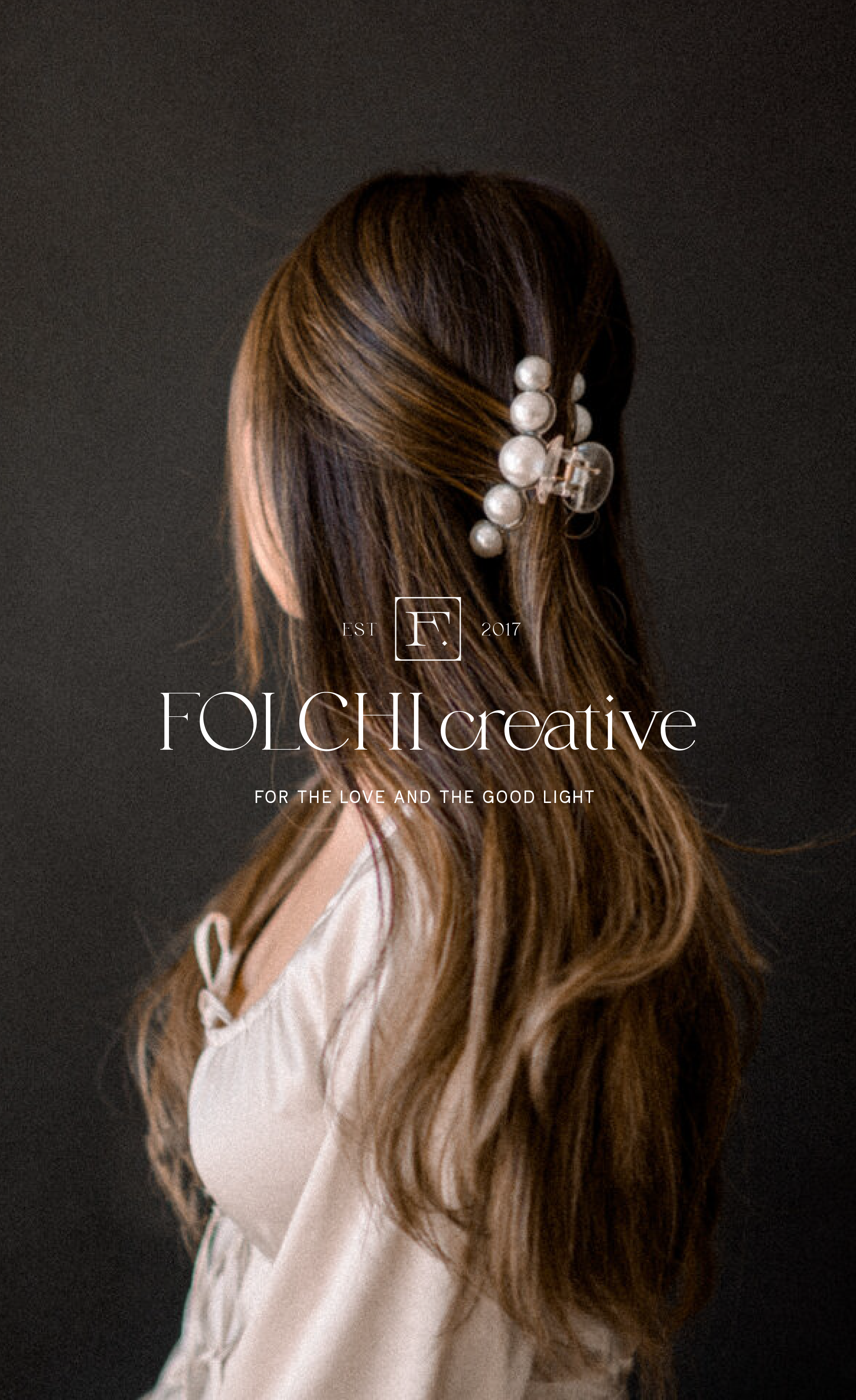
Warm, welcoming, fashionable and classic were key words Natalie Folchi wanted her updated brand identity to depict — as if you’re sitting in a Parisian café getting your photo taken by the incredibly talented photographer herself.

Case study includes —

  • primary logo

  • simplified wordmark

  • submark

  • set of four icons

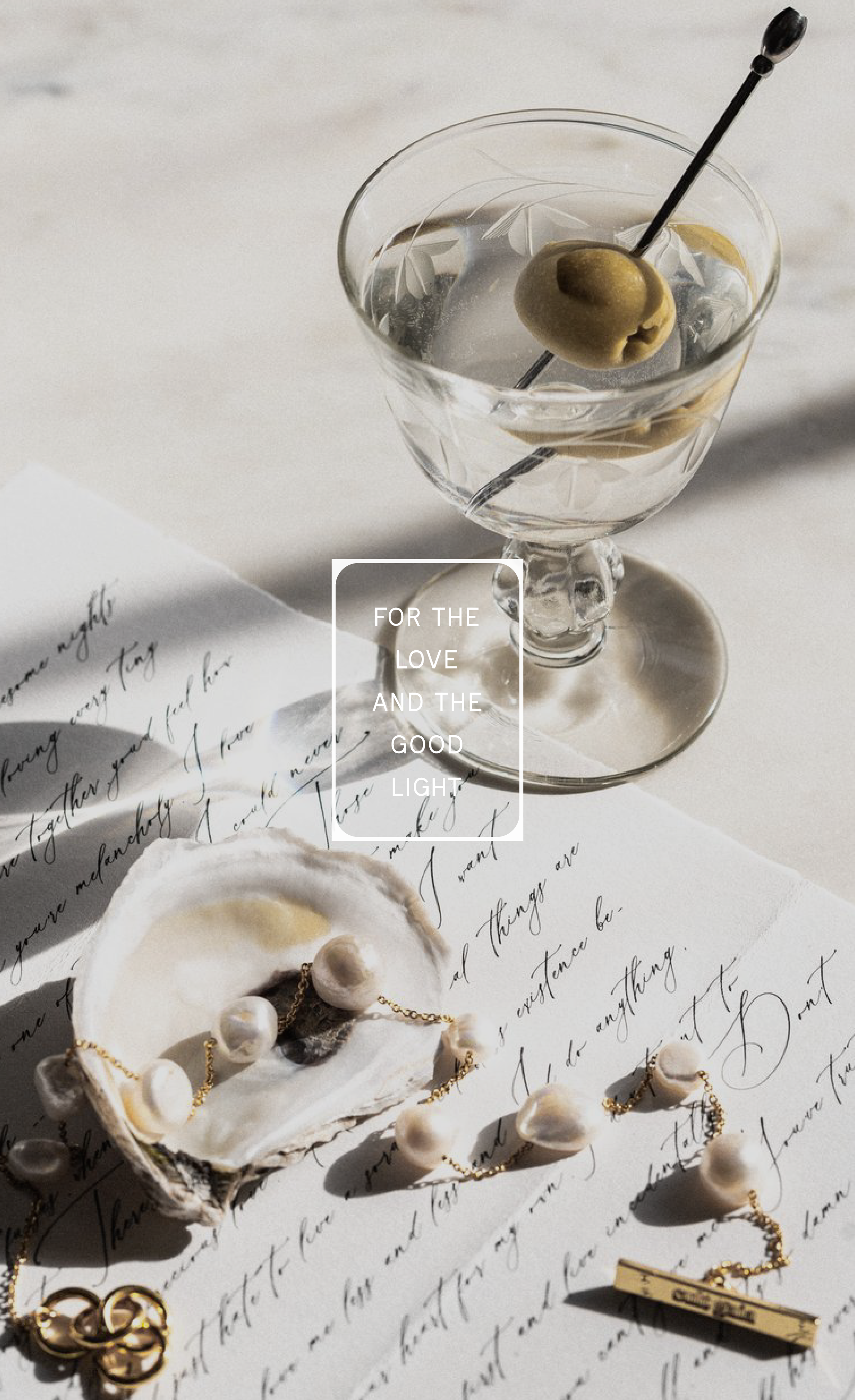
  • tagline, copy and design

  • brand voice and tone

  • color story

  • typographic system

  • brand guidelines

Brand Reel
Close-up black-and-white photo of a woman's face with her hand near her chin, and the text 'FOLCHI creative for the love and the good light' overlayed.

BRAND VOICE AND TONE

The brand feeling Folchi Creative exudes is a sophistication and sexiness that is portrayed through incredible light and shadow. Folchi Creative is elevated by nature and speaks to the highest level of timelessness through her captured imagery. Folchi Creative is chic but never snooty, fashion-forward and classic in style. Heart is poured into her work through every detail, edit and lens change.

Folchi Creative is here for the love and the good light, and lives in a confident state. She seeks success but doesn’t chase. She has a welcoming energy but carries a feminine edge. She will bring out a confidence in you all while carrying on a conversation, capturing your special moments (and potentially drinking an extra dirty martini).

A jewelry display with gold chain necklaces on a large white shell and sandy surface, with the text "For the love and the good light" overlaying the image.
A black vase with white flowers on a round, light-colored table against a plain, light-colored wall.
Color palette showing six oval swatches labeled as black, soft white, olive, sky blue, soft pink, and pure white, each with descriptive words underneath.

OUTTAKES

concepts I love, but didn’t make the cut

A minimalist gray textured background with black text that reads 'FOLCHI CREATIVE' in large font, and underneath in smaller text 'FOR THE LOVE AND THE GOOD LIGHT'.
Elegant display of two dark green business cards with white text on a gray circular stand and flat surface, set against a backdrop of white curtains.
The word "FOLCHI" printed in black on a light gray textured background, with the letters arranged in two lines.
Two white boxes with business cards placed on top, one with a monogram logo and the other with the text 'foliCh creative' and contact details, set against a plain surface.

NATALIE’S TESTIMONIAL

Kind words from Natalie Folchi on the experience that was creating her brand with Emma Peugh Studio…

Testimonial text overlay on a gray background with a white flower arrangement in a black vase.
Back to All Case Studies